Case StudyEnterprise Health Portal
Replacing a convoluted spreadsheet system with a global crisis-response dashboard.
Before the Enterprise Health Portal, the client's customers navigated a convoluted matrix of Excel charts with technical medical references and 500 supporting documents — a system that frequently caused confusion exactly when clarity mattered most: during emergencies.
TL;DR
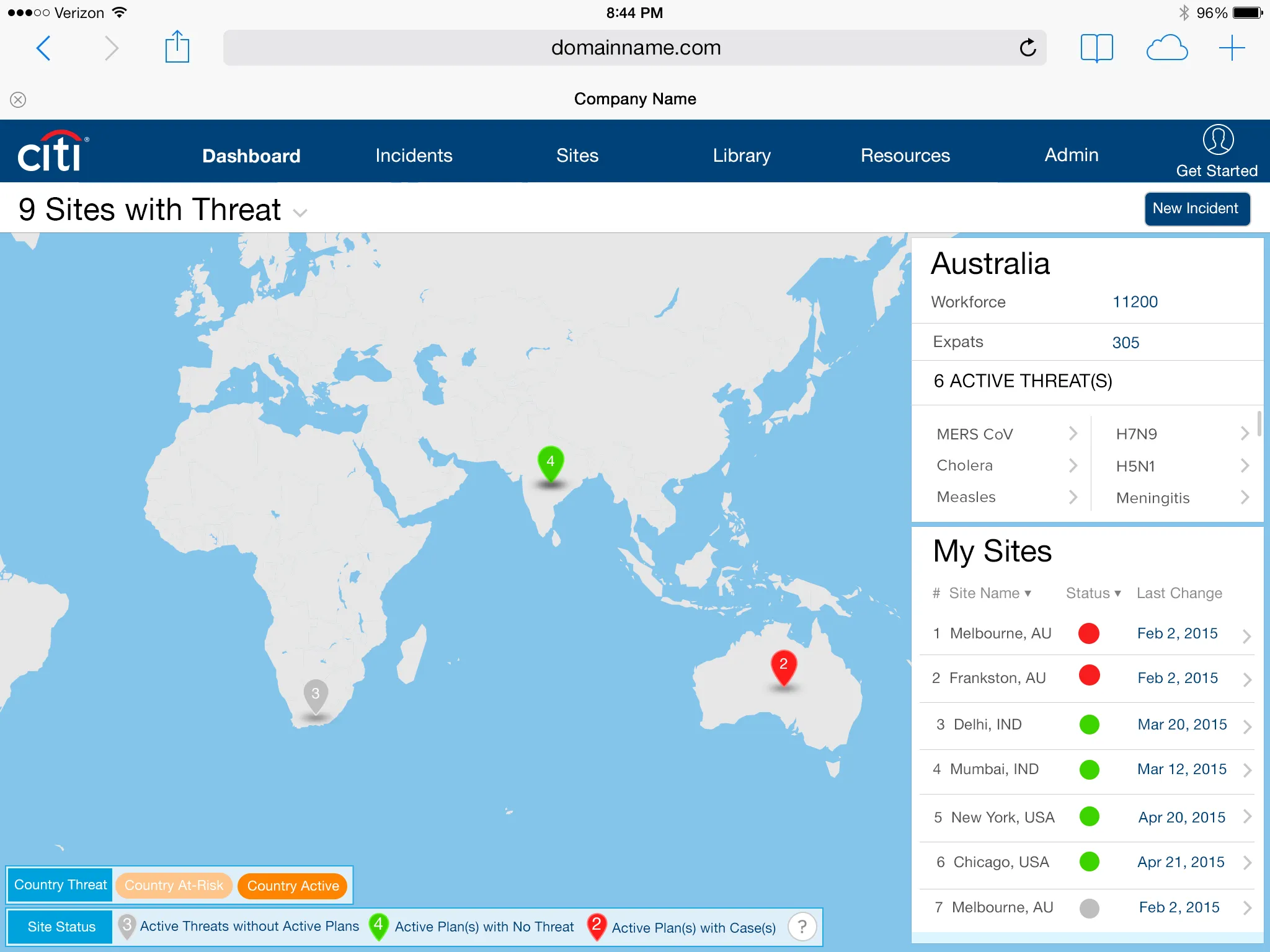
Role-based dashboards that turned a spreadsheet crisis tool into a real-time response system.
- Led design of EHP, replacing a complex Excel-based system used during health emergencies
- Created role-based dashboards and navigation to deliver relevant real-time information for managers and employees globally
- Conducted rapid prototyping, collaborative design sessions, and usability testing with an 85% task success rate
- Designed interactive features like "Plans in Action" for task assignment, status tracking, and streamlined crisis management
- Successfully launched with strong client adoption and potential for future integration with broader health systems
Background
When a public health threat looms, organizations can struggle to fully understand the implications of the threat on their business and people. The Enterprise Health Portal was designed for companies to access the latest medical content and pandemic incident plans to effectively respond to health threats to their employees.
The platform hosts the latest information about the disease outbreak, as well as a library of incident management procedures, posters, and communication documents for employees in an affected area to use. The tool was developed to raise an organization's preparedness when responding to emerging health threats and fulfill their duty of care obligations.
A new dashboard gives managers a global view of their locations in relation to global health threats, along with customizable, simplified management checklists and consistent action plans to use quickly across their global sites.
Problem
Before the Enterprise Health Portal (EHP) was created, the client provided its customers with a convoluted matrix of Excel charts with technical medical references and 500 supporting documents. The product frequently caused user confusion when it was needed most — during emergencies.
Solution
I led the design for the EHP — a completely new enterprise application that allowed users to:
- Set user permissions and different views of information
- Access all pertinent medical resources based on the current threat
- Receive real-time updates of office status and resource allocation
- Monitor all employees' health at a company's offices — either on-site or remotely
- Have constant communication with remote employees and corporate headquarters
- Set standards for version control of documents
Process — Step 1
Evaluate current process to reference data and resources
I worked with the client to gather usage statistics about how the product was being used. The information showed that customers were confused and quickly overwhelmed using the existing product — as a result, many valuable product features were being overlooked.
Process — Step 2
Create new global navigation and user roles
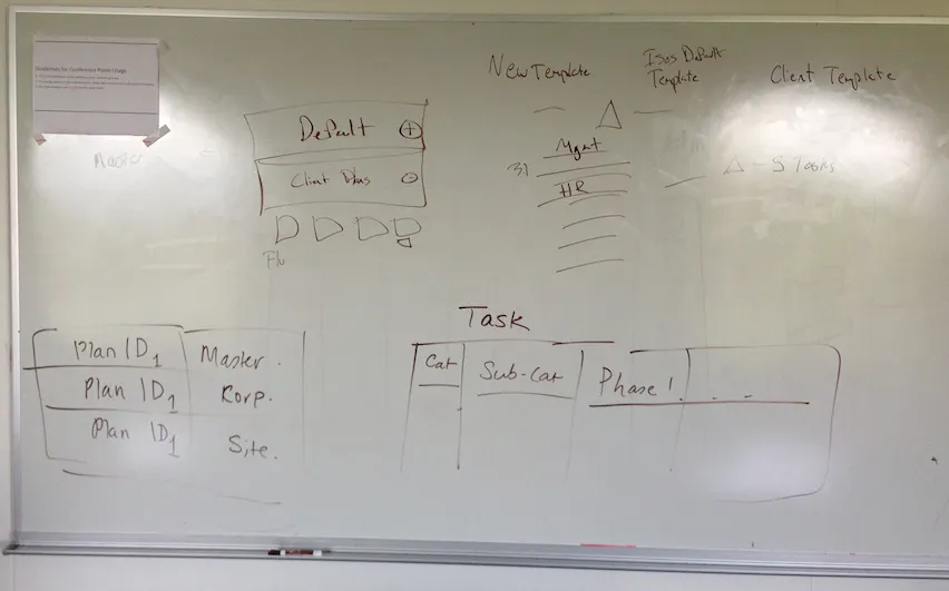
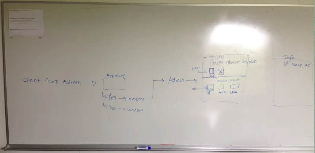
One of the crucial decision points in the design process was refining how different users saw information. For example, a junior-level employee needed certain information to support the team, but a director at corporate headquarters might need some, if not all, of the same views and more. Determining the best structure to show this information to each user type proved challenging. In the image below, I'm working with my Project Manager to understand the technology's constraints and teach her the flow to access default and custom templates.
Process — Step 3
Brainstorming and rapid prototyping
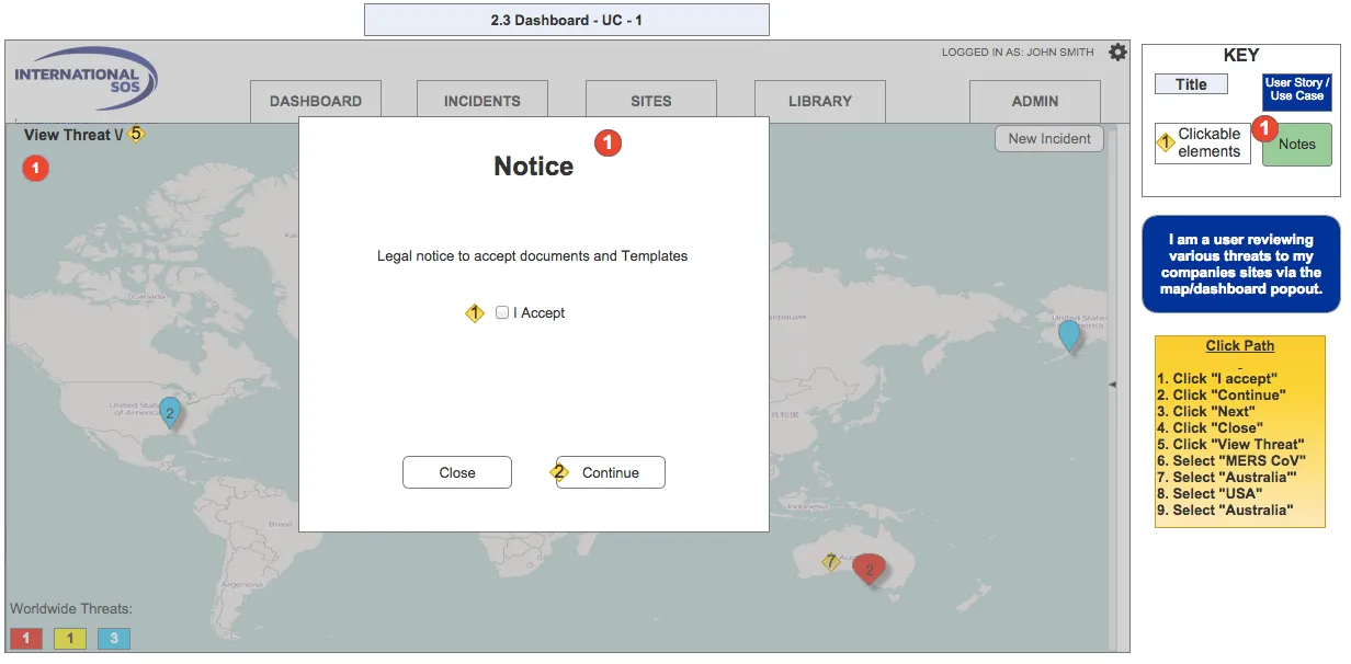
After various sketching and whiteboard sessions, I started building clickable wireframes in Axure 7. I was lucky to have a client eager to see the product launch at its potential, so we often held design sessions over GoToMeeting, rapidly iterating designs and discussing key user flows, features, constraints, and cost-benefit trade-offs. Below are some early prototypes of different dashboard functionalities.
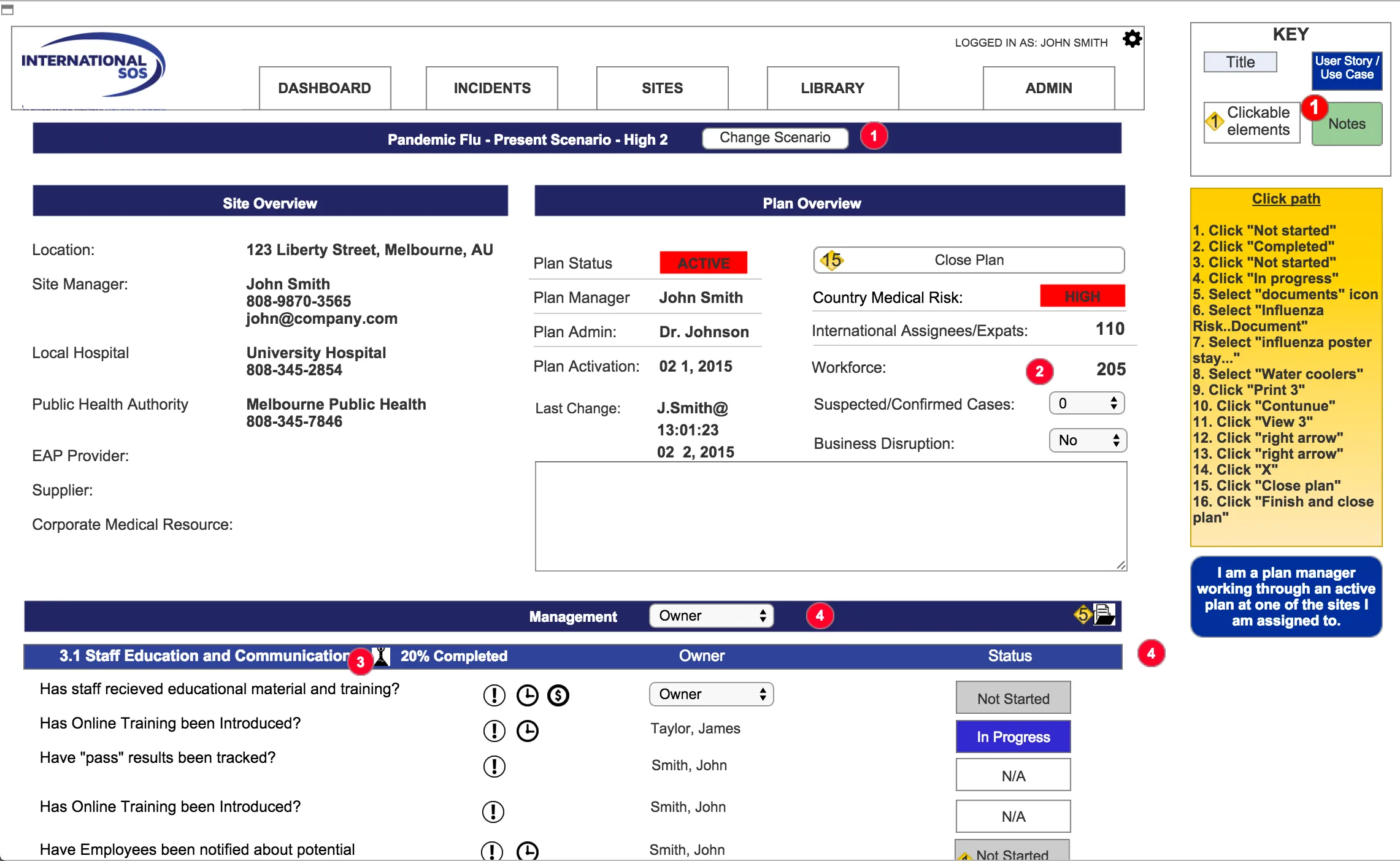
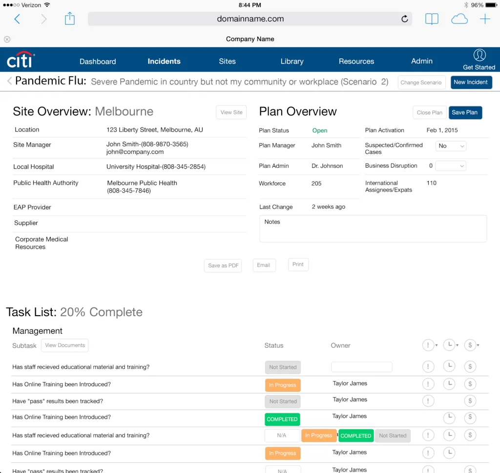
Process — Step 4
Iteration and further design
Feedback: Throughout the process, I received frequent feedback from the client's project manager and even our sales team as we worked to validate the proposed design as an effective solution — a strategy that proved effective at gaining buy-in from stakeholders on both sides.
Visual design: I worked closely with the Visual Designer to refine the navigation and color palette. This was a fun challenge, since one product requirement was letting customers style the application to their own brand's colors — so the default palette had to be generic enough to work with many different customers.
Interaction specification for development: I created a manual of interaction design specifications as a deliverable for engineering, including all micro-interactions within the application, to help ensure design accuracy and speed up development time.
User testing: I conducted user testing with leaders who oversee their company's offices and staff vulnerabilities around the globe. Results were positive, with an 85% success rate on primary tasks — development was pleased, and only a few different call-to-action placements needed adjustment.
End Result
Test participants found the EHP to be well organized, very useful, and easy to use. The client's launch customers responded positively to the product, and there is potential for the dashboard map to be used by the World Health Organization. The application should stand strong while properly integrating other product lines the client offers in the future — the newly designed EHP will support and even enhance the workflow of those other application features.