Case StudyProduct & Portfolio Management
Redesigning an enterprise PPM platform used by 90% of the Fortune 500.
The existing PPM platform suffered from usability issues and diminishing business value, leading to customer churn — a fragmented experience across its numerous interdependent modules that hindered visibility and collaboration for everyone from CEOs to contractors.
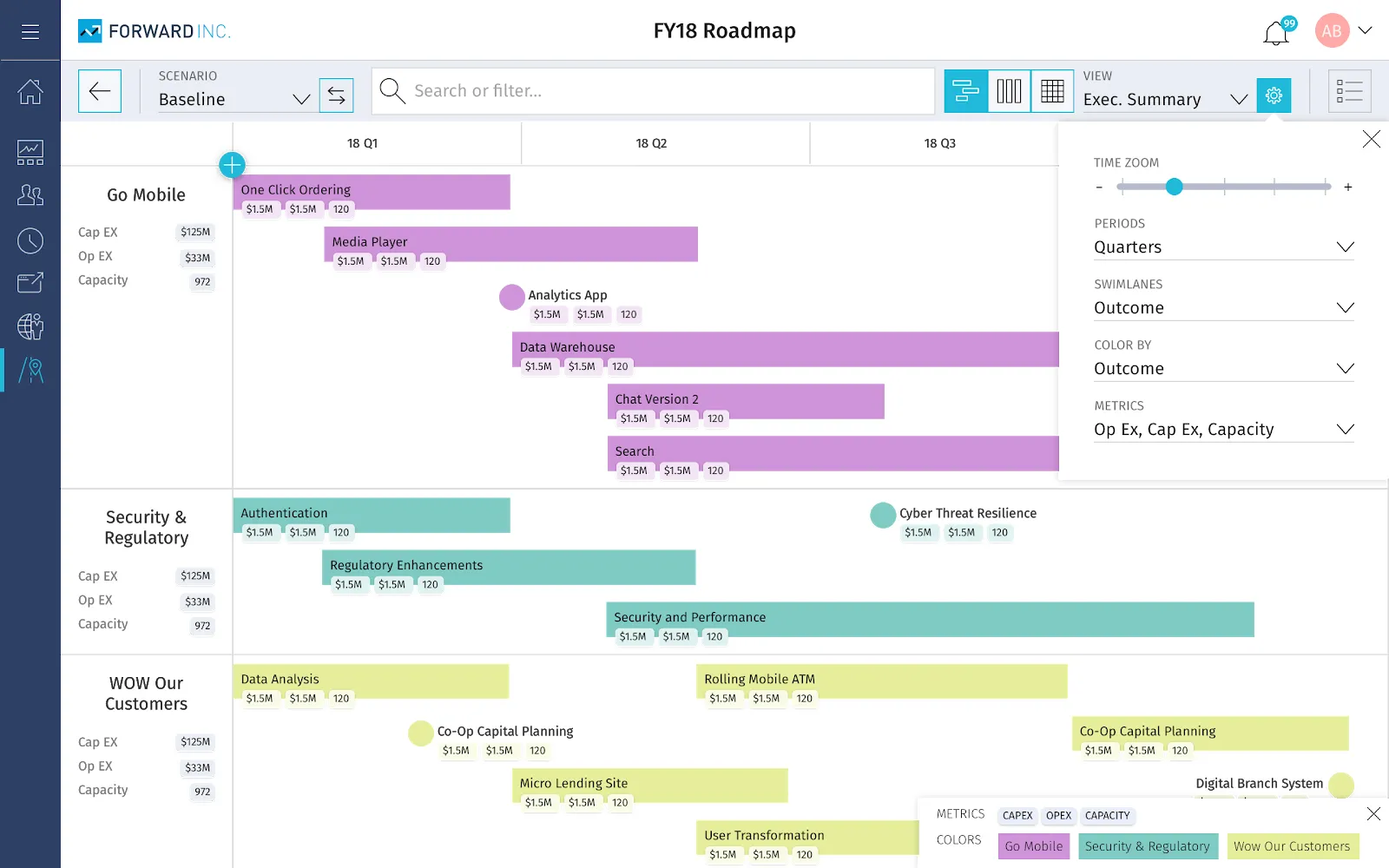
Solution & Contributions
A multi-year, ground-up redesign across 17 core PPM modules.
Strategic Partnership: Co-created a cross-functional product-discovery and feature-delivery system with Product Management, aligning Design, PM, and Engineering on priorities and vocabulary. Partnered directly with executive leadership to shape product strategy across the portfolio.
Design System & Team Scaling: Designed and managed a new component system to drive platform-wide consistency. Grew the UX team from one to four designers and introduced a culture of self-driven designers, elevating design's influence in product decisions.
User-Centered Transformation: Started a continuous customer-driven research process to inform design decisions and validate solutions for complex, customizable workflows. Defined core principles and data models (like the Work Breakdown Structure) to ensure scalability and contextual relevance for diverse personas.
Impact & Outcomes
- Strategic Alignment: elevated design understanding and ensured consistent quality standards across a wide variety of stakeholders, bringing UX to the forefront of product strategy — recognized by internal stakeholders as having "saved this product."
- Enhanced Usability & Retention: a 73% reduction in time on task for the Admin module, plus a noticeable increase in NPS and overall usability metrics.
- Operational Efficiency: the multi-view Roadmapping module solved critical version control and communication breakdown issues.
Background
PPM helps large companies break down silos and gives anyone, from the CEO to part-time contractors, visibility into planned work and the status of current works-in-progress. PPM is customized to each business' specific needs and processes — customers like JP Morgan have different needs than Boeing, Coca-Cola, Amazon, Ikea, or Disney. The image below is an older example of the complexity and interdependencies of a company like Disney, which was often a good reference in the design process.
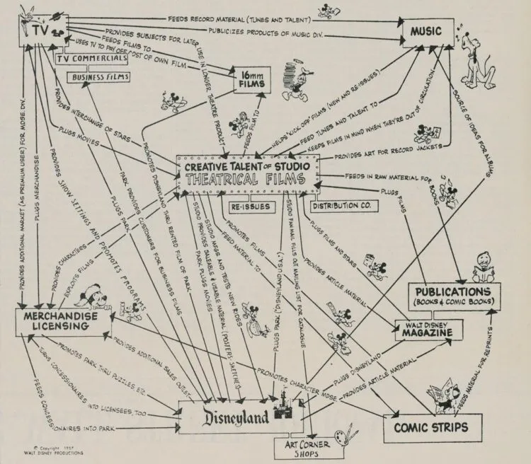
Modules like Conversations, Tasks, Risks, Documents, Financials, Issues, Changes, Staffing, Projects, Administration, Timesheets, and Roadmapping worked in unison and shared relevant data that kept people and teams in sync to help companies function.
Problem
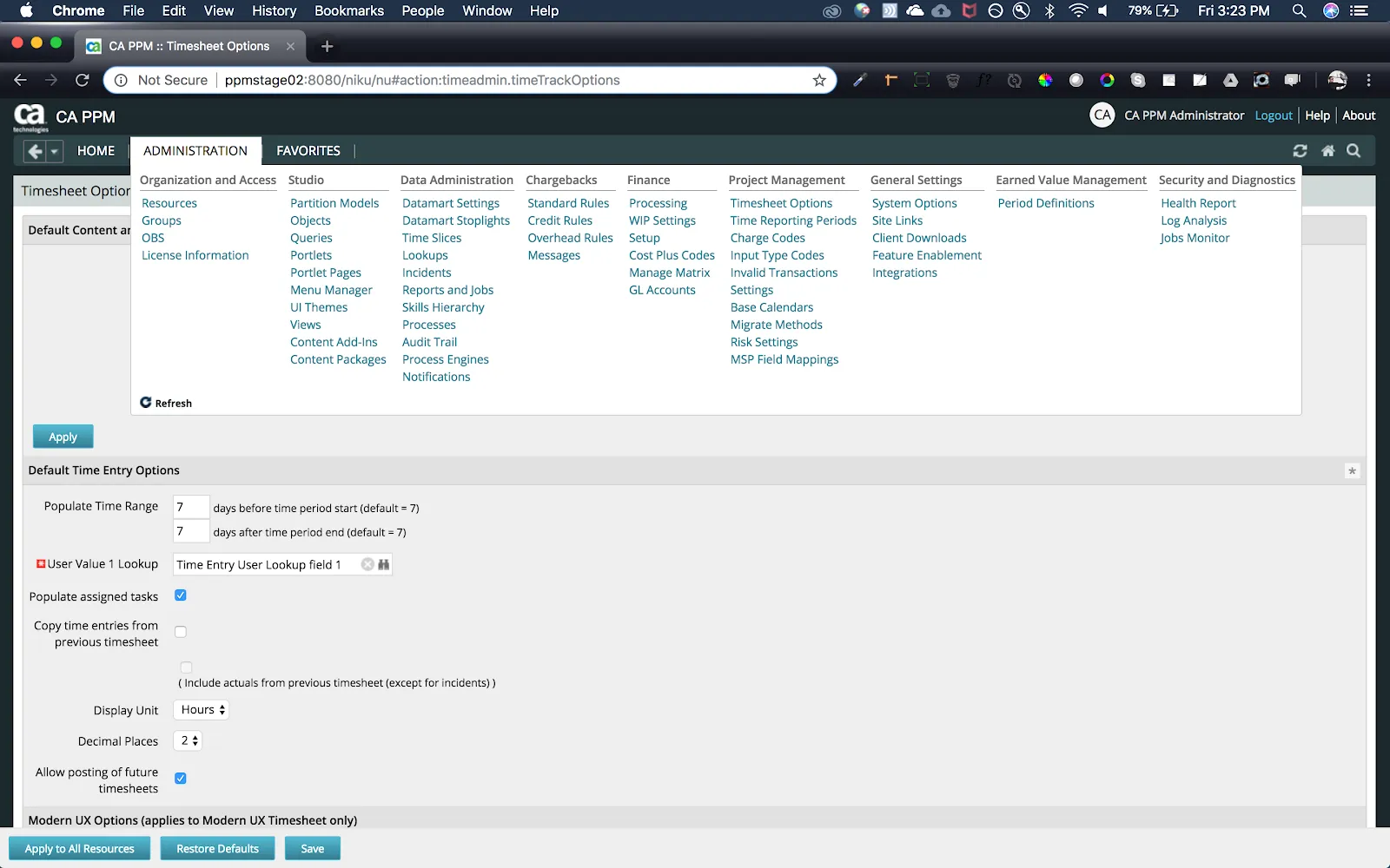
Over the years, PPM had fallen behind in its usability and overall business value. As UX began to modernize interfaces industry-wide, PPM fell further behind and lost customers. I was hired to redesign the product from the ground up. Below is an example of the information architecture and overall UI at the time.
Solution
I worked on PPM for three years and achieved the following high-level accomplishments:
- Lead design of 17 PPM modules including: Admin, Roadmapping, Projects, Analytics on mobile and desktop applications
- Grew team from one to four designers with one researcher
- Worked with Product Management to co-design a product-discovery and feature-delivery system that helped Engineering, Design and PM align, set clear priorities and share the same vocabulary
- Worked closely with a wide variety of stakeholders to elevate design understanding and ensure designs were consistent and met quality standards
- Designed component system and managed component system backlog
- Created a culture of self-driven designers, empowered to help drive the product roadmap and help bring UX to the forefront of product decisions
- Consulted with Executive leadership on Product Strategy amongst the portfolio
Note: this case study highlights the design of the Admin and Roadmapping modules.
Process — Admin Module
Background, research and discovery
An administrator has authority to architect the entire PPM instance for their company and have it customized to their business' process and needs. The bulk of an administrator's time is spent collaborating with stakeholders to create and maintain templates for the various divisions, teams, and individuals.
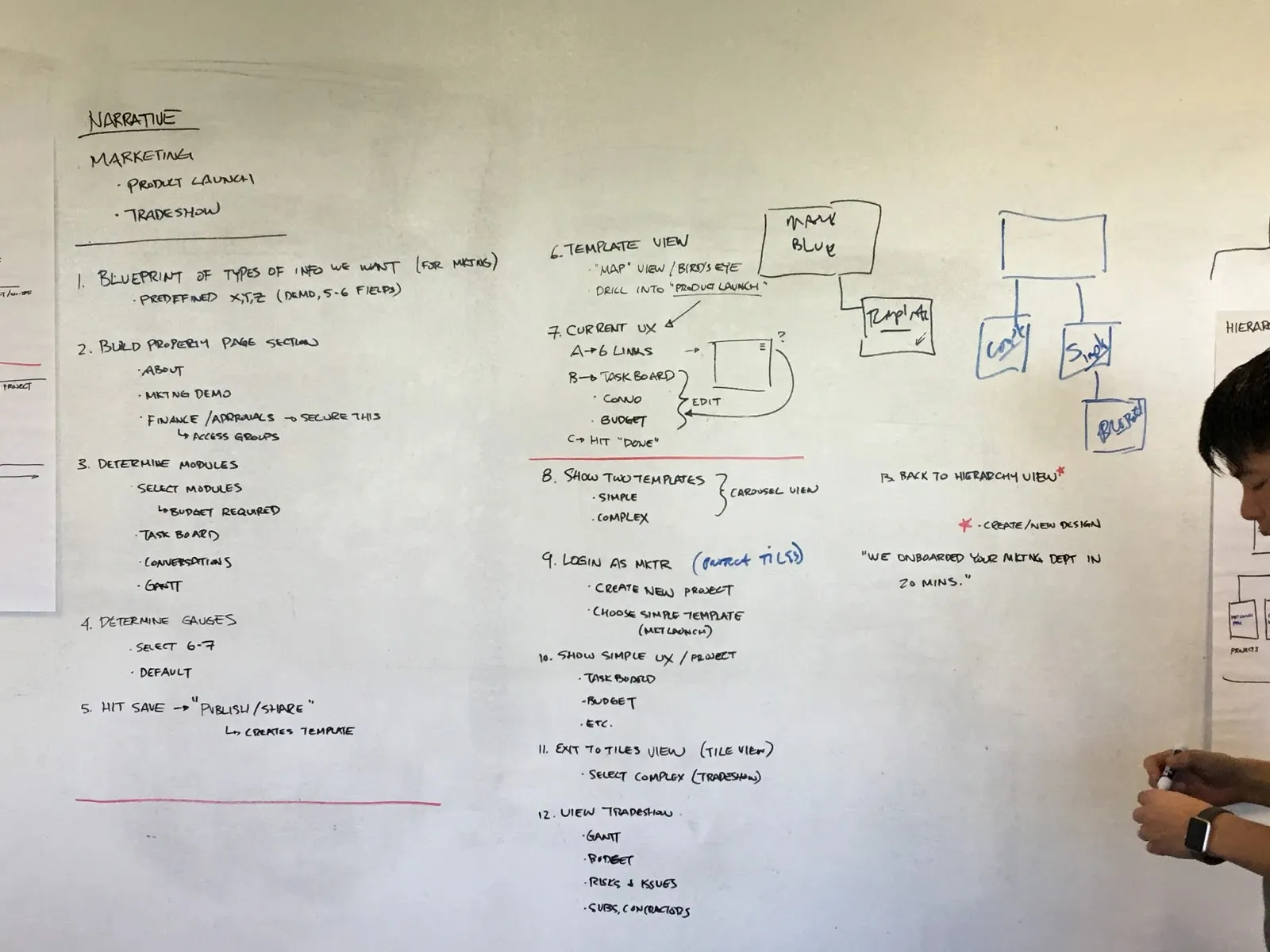
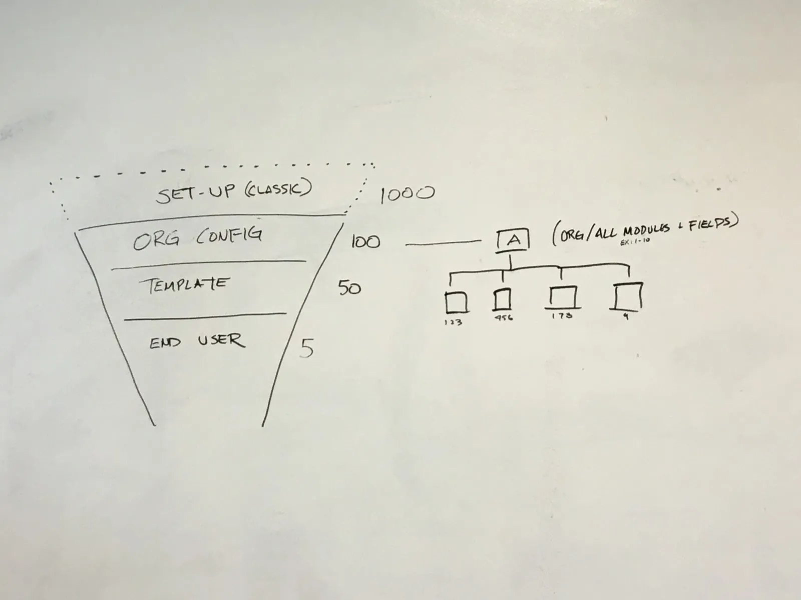
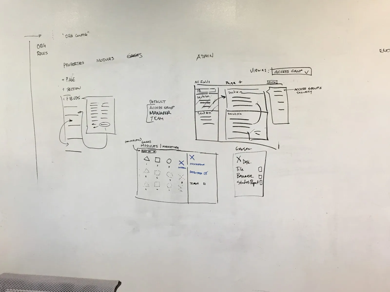
To start the redesign of the Admin module, my team met with three customer Admins for initial contextual interviews and then kicked off a three-day design sprint to move quickly. Here you can see the detail page and module screen come to life during the sprint:
Prototype
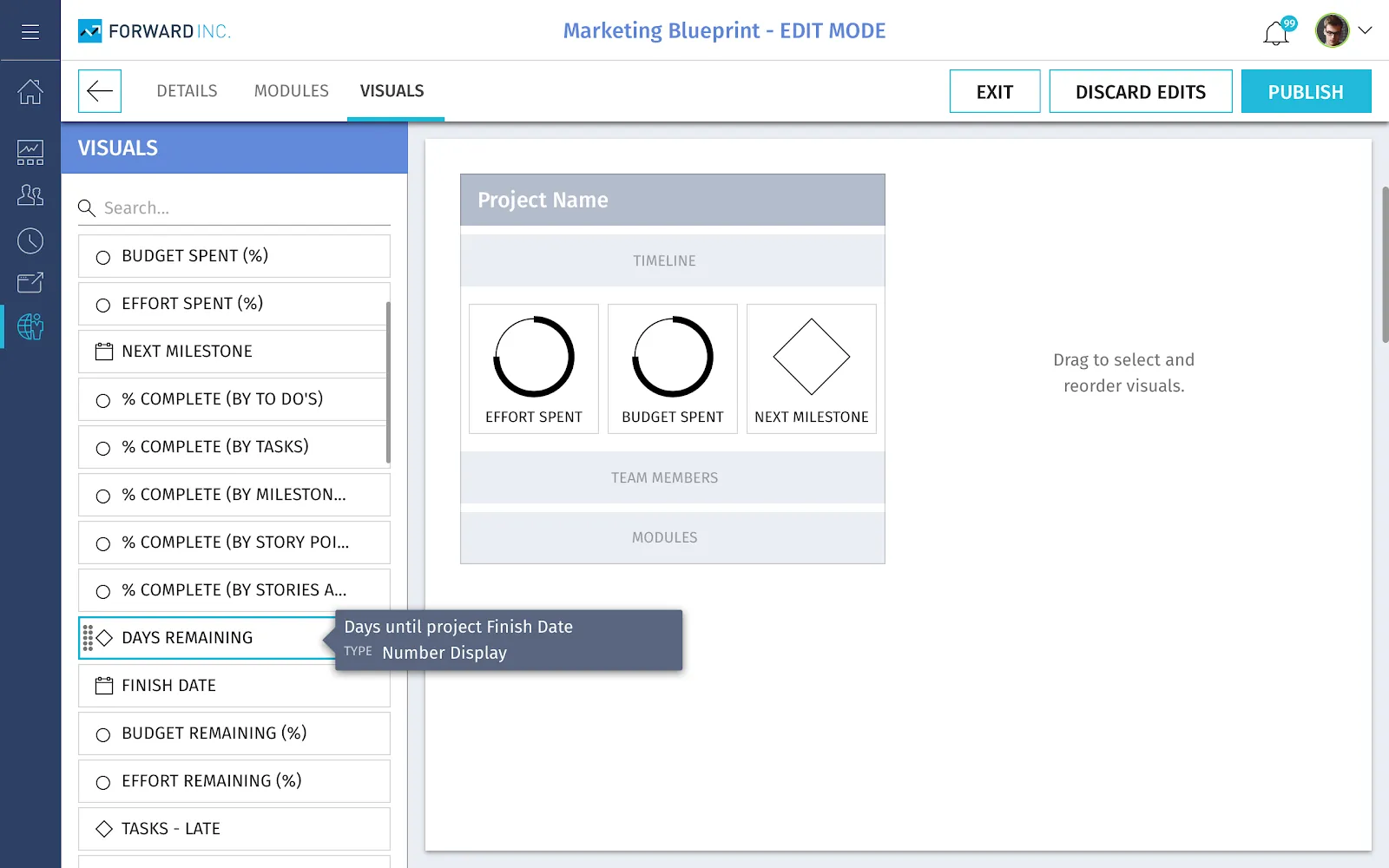
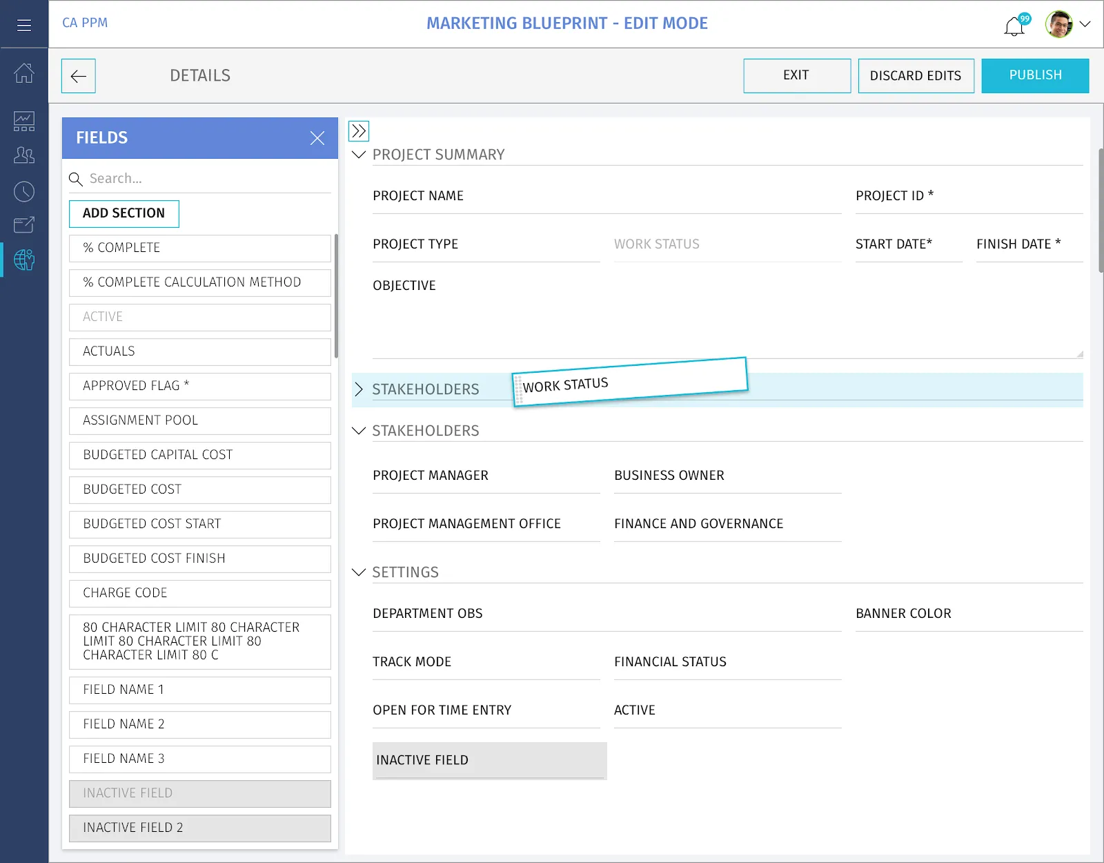
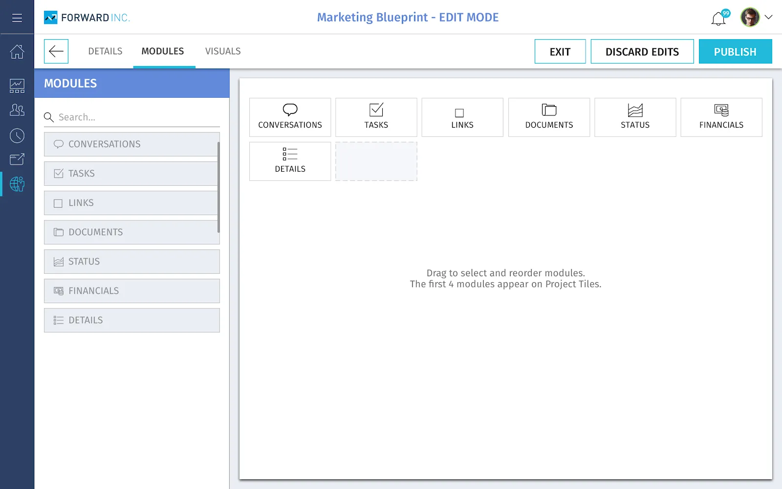
After the sprint, I started to create rough clickable prototypes in Axure. After a few internal iterations with PM, the team met with customer administrators and asked them to create a new project blueprint. Our primary measure of success was time on task compared to the current Admin module.
Research & Findings
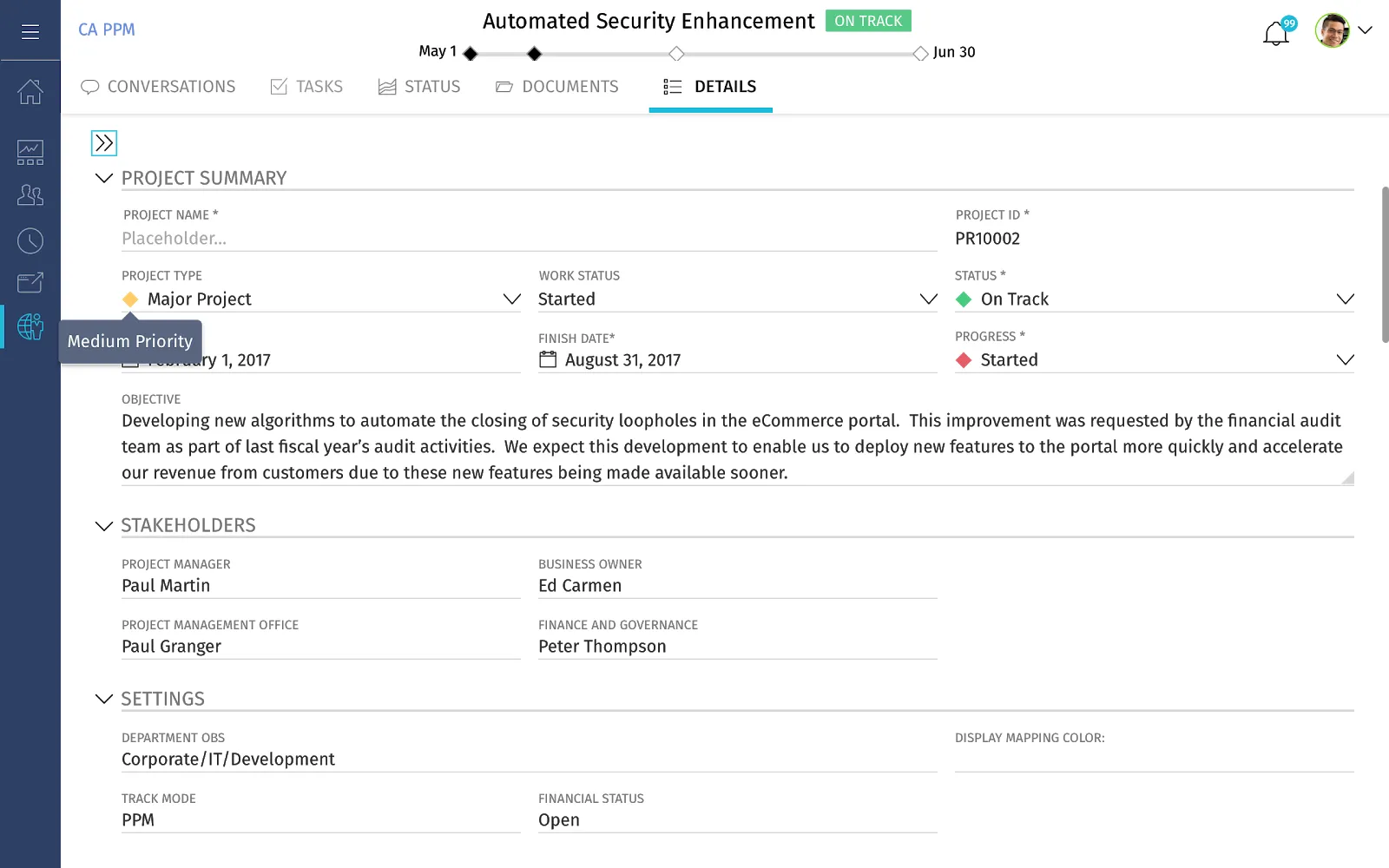
User testing revealed time on task was reduced by 73%. In the deliverable below, the attribute details of a project can be referenced within the last tab of any project — a location that allows for business planning, continuity, and ease. If an issue ever came up, the end user could call an Admin to reference exactly where a field lived in the template details.
Process — Roadmapping
Background, research and discovery
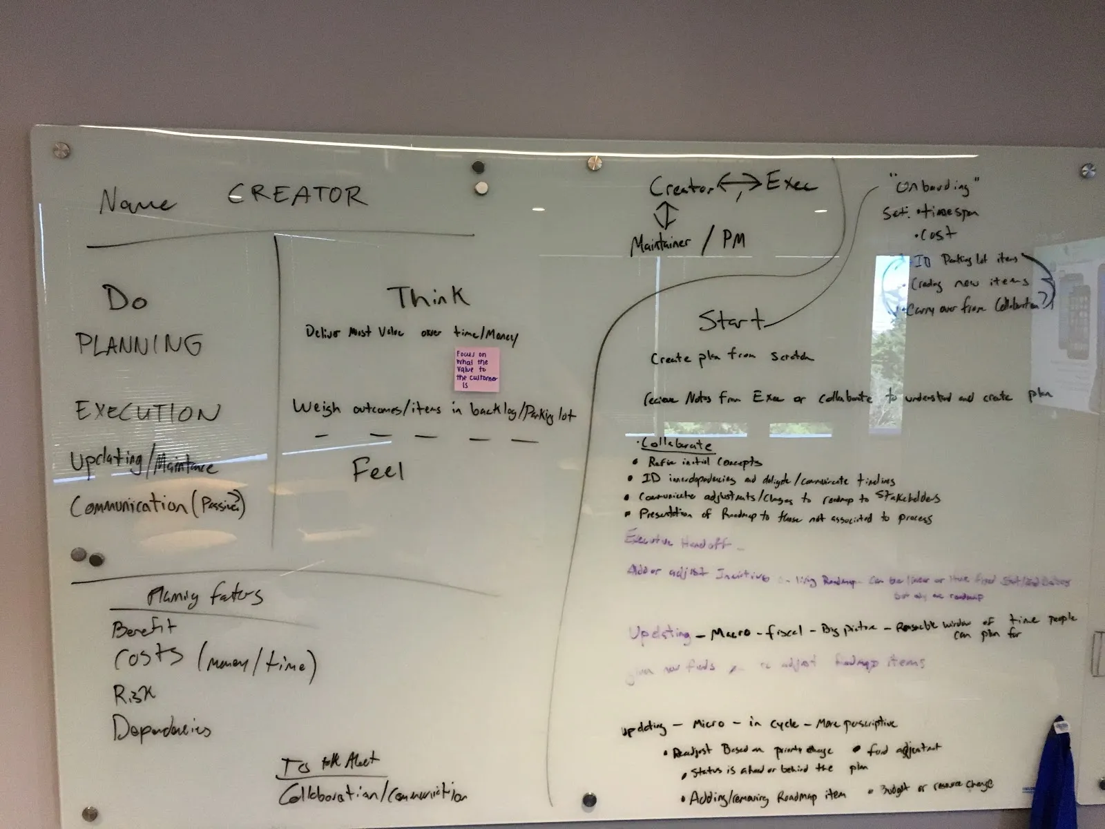
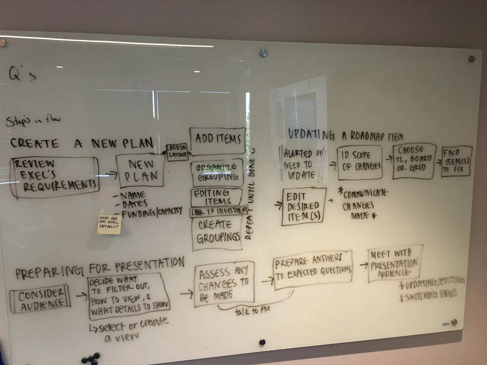
Roadmapping is a shared view that clearly communicates project planning and status across divisions. Early research made clear it would be a heavily-used module. PM and UX identified five key customers across sectors for contextual inquiries into their planning process — what was working, and what wasn't. Customers often shared photos of sticky notes and affinity diagrams from past meetings, or spreadsheets with no version control that led to communication breakdowns and confusion.
Defining First Principles
PM came to my team with many ideas that didn't quite fit together. After a lot of deliberation, we distilled them into simple diagrams to align ourselves and PM around the problem. One of my designers created the diagram below, which helped frame many conversations about work breakdown structures — thinking in first principles was key to the group's ability to reason clearly about such complex topics.
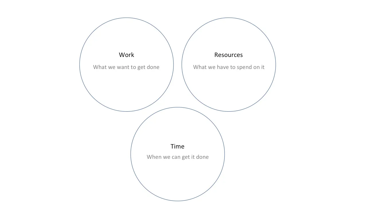
Other principles my team defined for Roadmapping:
- Set the right context, at the right levels — use of a common framework across the various issues allows for integration, synchronisation and alignment of the organization
- Share one vision, but embrace diversity — be flexible to the different strategy issues companies, divisions, teams and their employees face
- Be scalable at different organizational levels — apply both broad and specific analyses, embrace innovation and scenario evaluation
Systems Thinking
I created the diagram below to help align the UX and PM teams on the data flow model called the Work Breakdown Structure (WBS):
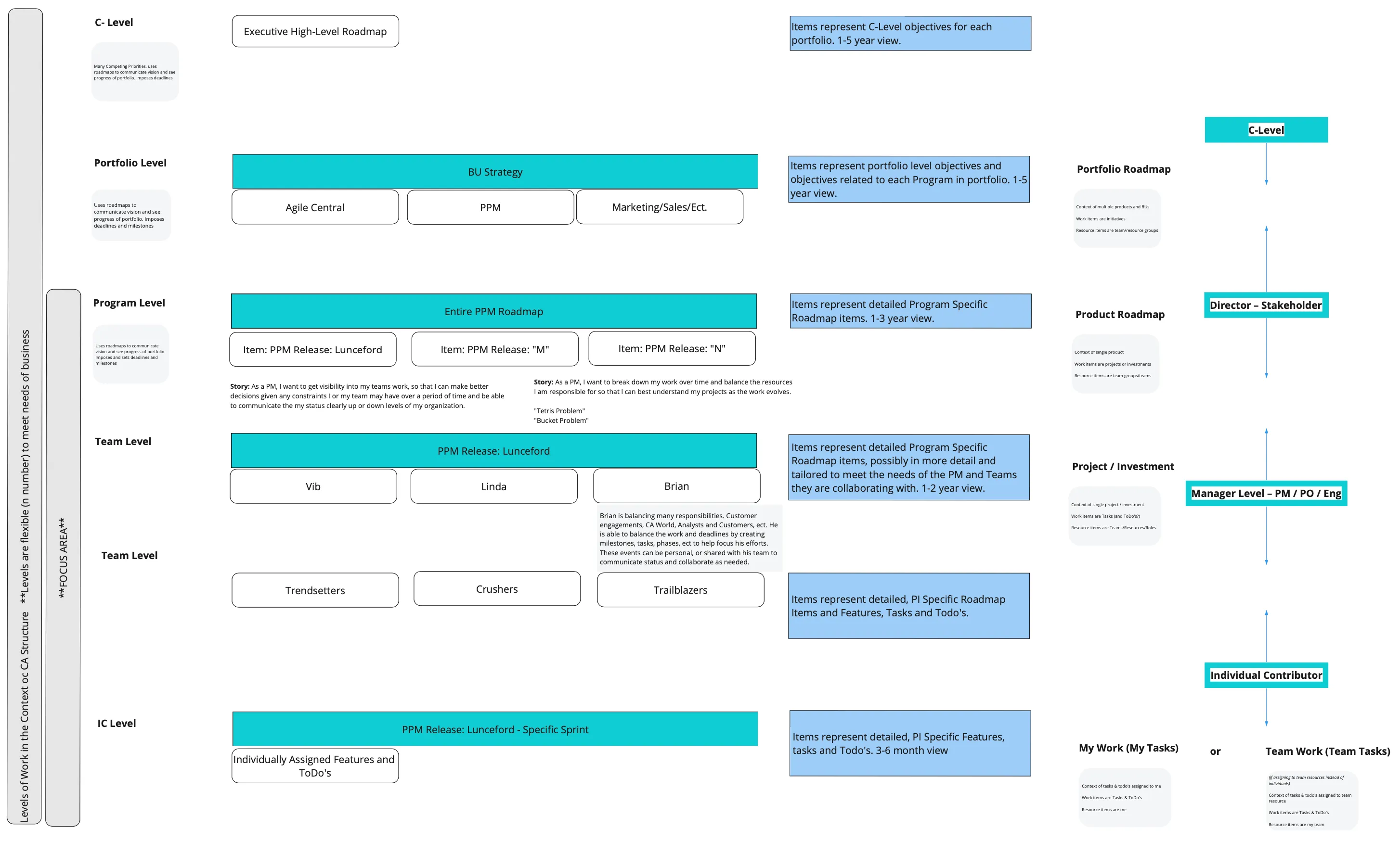
Hypothetically, during a meeting, a director can build and share a roadmap with the executive team and speak to metrics and status updates that make sense at that level. Later that day, the same director can sit with their direct reports and share a more detailed, granular view of how the work is being done day-to-day. Behind the scenes, WBS tracks the progress of these projects in real time and presents it to each persona, at each level of the company, in the way that makes the most sense to them.
Design Iteration
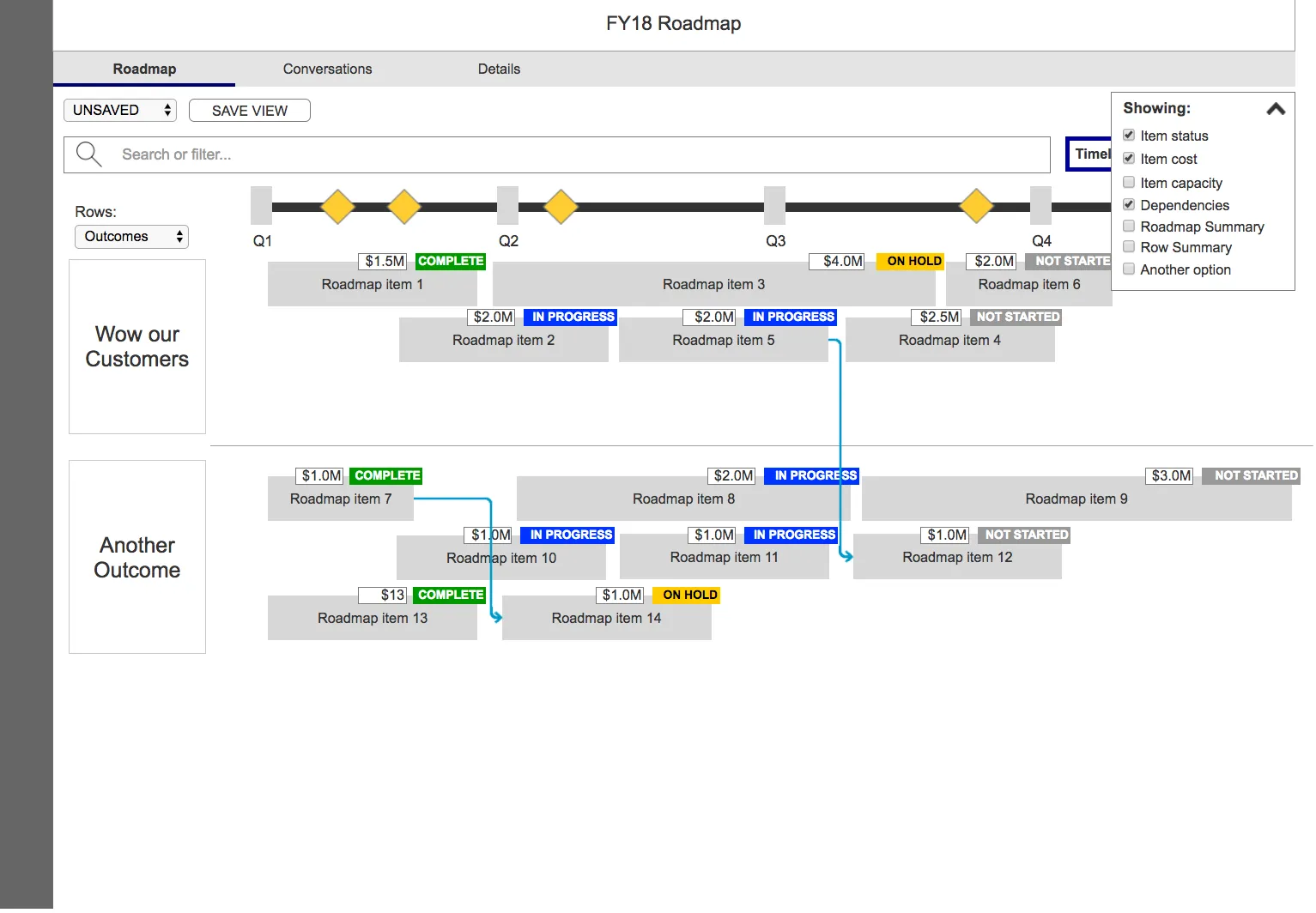
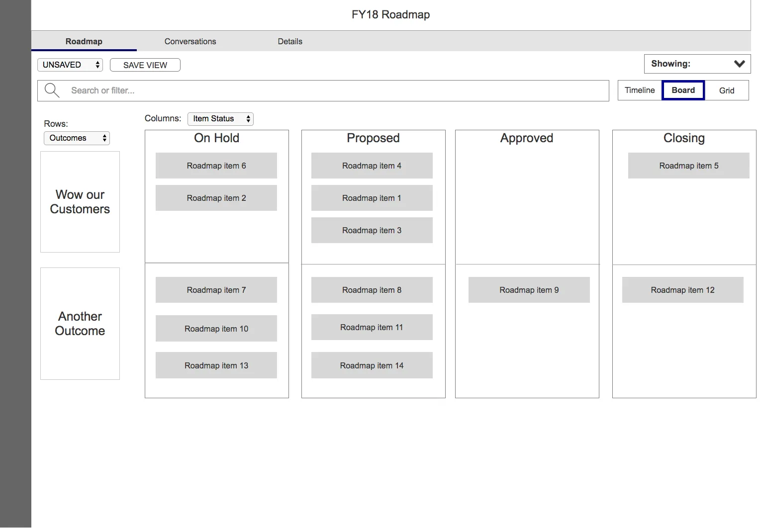
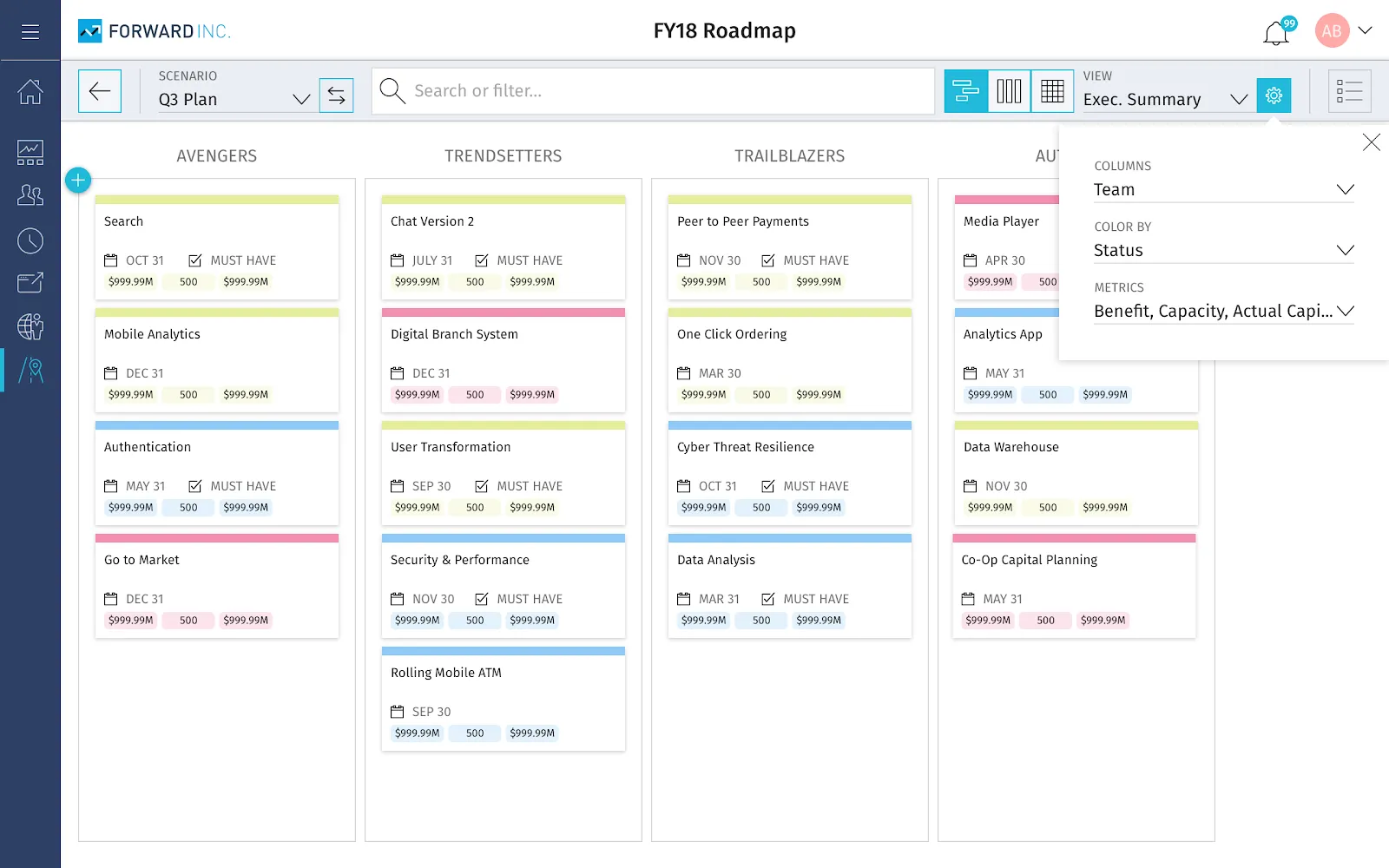
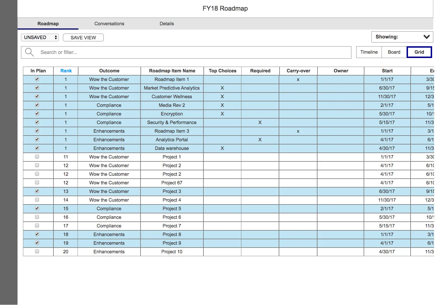
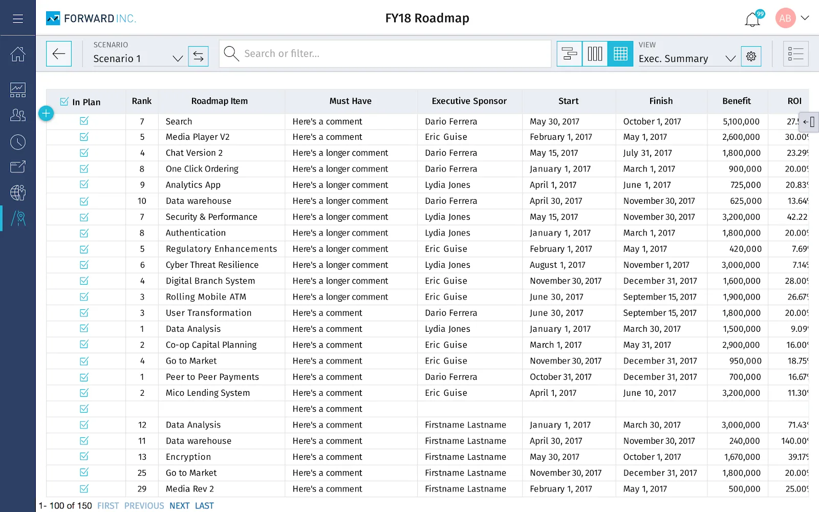
My team met with stakeholders daily and as a UX team in the afternoons. Together, we came up with features like Saved Views, Dependencies, and Scenarios. Possibly the biggest user benefit this module provided was the Timeline, Board, and Grid views — a three-way toggle that let users visually interpret, pivot, and configure the same underlying attribute data in different ways.
Timeline View
Board View
Grid View
End Result
The interaction spec below was delivered to Engineering and was also given to the VP of Product to present at the company's annual customer conference.
Reflection
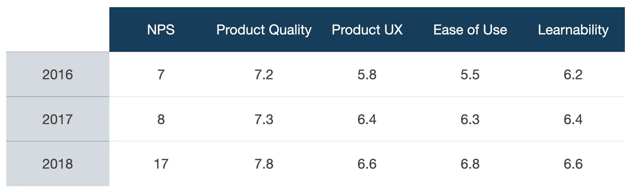
Over time, our NPS started to improve and key metrics for usability steadily increased, too:
A lot of this success was made possible by my direct team. That said, I think the reason the product was successful was due to the integration between PM and UX. A lot of trust was built — we communicated fluidly and embraced the wildest of ideas while keeping the customer in mind and researching assumptions early and often together. Below is some feedback from internal stakeholders:
“UX is always refining the product. They are never done and are always there to help us understand.”
— Product Owner
“You help us see the problems more clearly and communicate to other stakeholders.”
— Product Manager
“You have saved this product…”
— Senior Director of Product Management